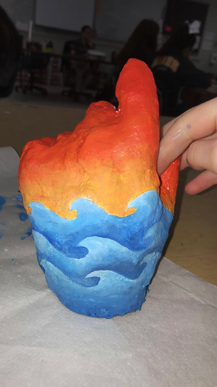
I created this plaster hand in Art 3. We were required to use two different mediums, one on the front of the hand and another on the back. This is one of my favorite projects because of how well it turned out.
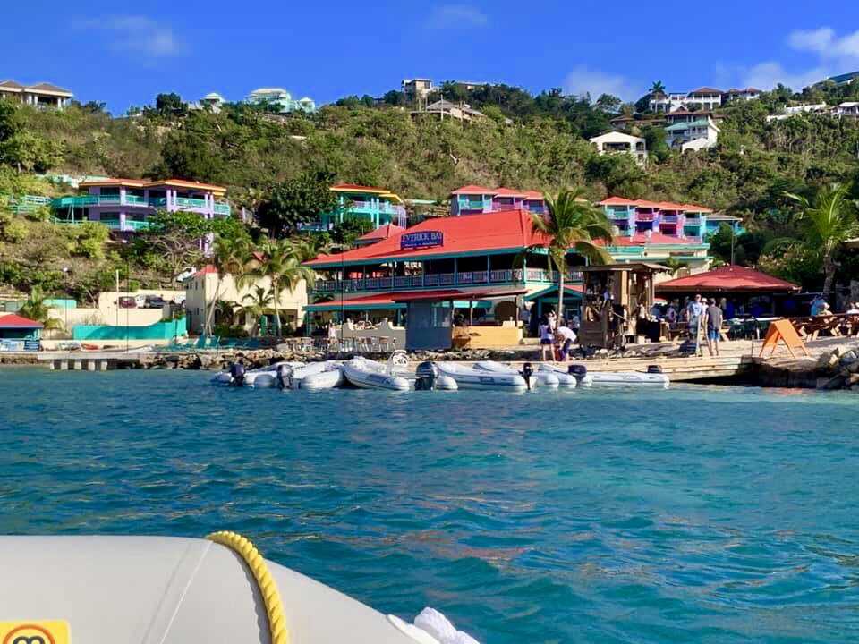
This picture was taken in the British Virgin Islands. One thing I loved the most about this beautiful place was the scenery and the many opportunities for pictures.
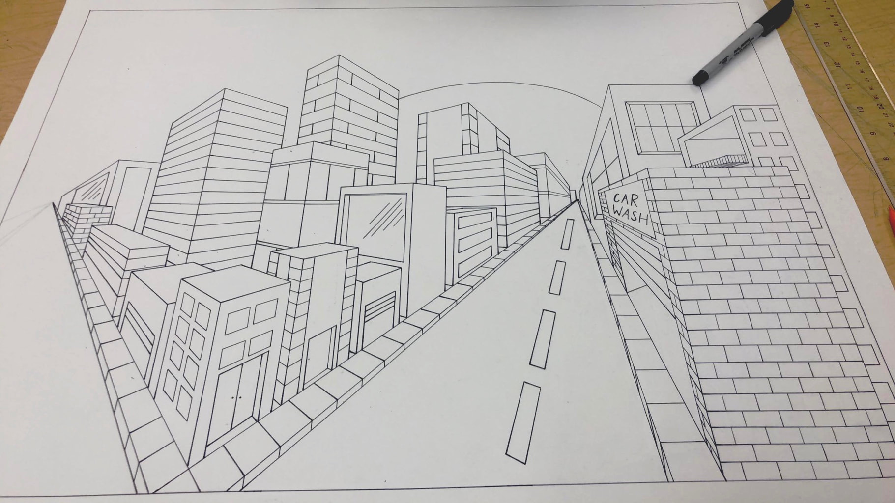
Two point perspective has always been one of my favorite drawings to do. I was very proud of how this piece came together as I finished outlining everything in sharpie.
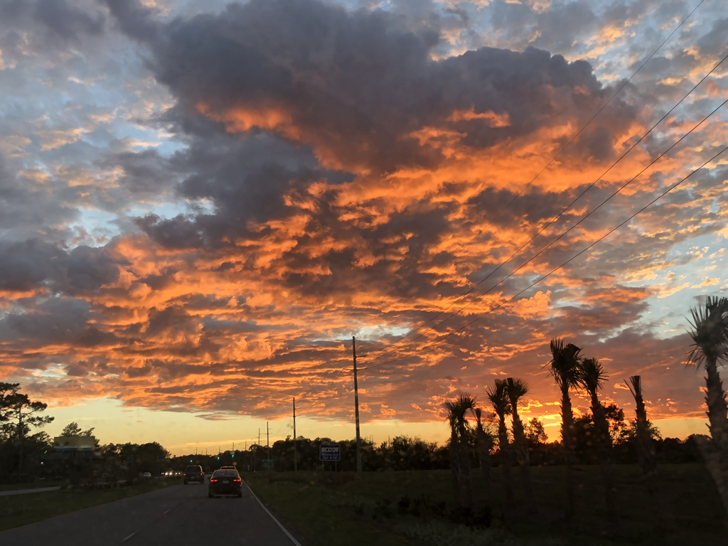
I have always loved photographing sunsets. This picture captures the blue, orange, and pink colors of the sky perfectly.
This was the first project assigned in Art 3 Honors. We had to draw and capture an image in “Still Life.”
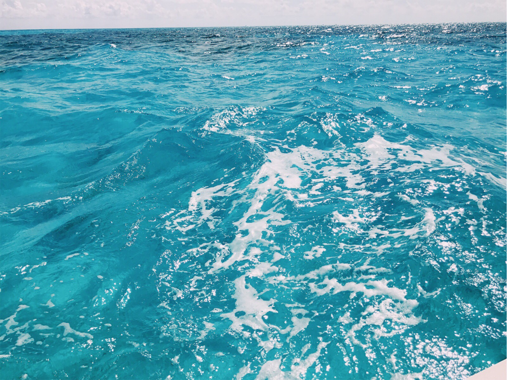
I captured this picture while I was in the Florida Keys. I have always thought water has a unique glare during the summer as the sunlight shines upon it.
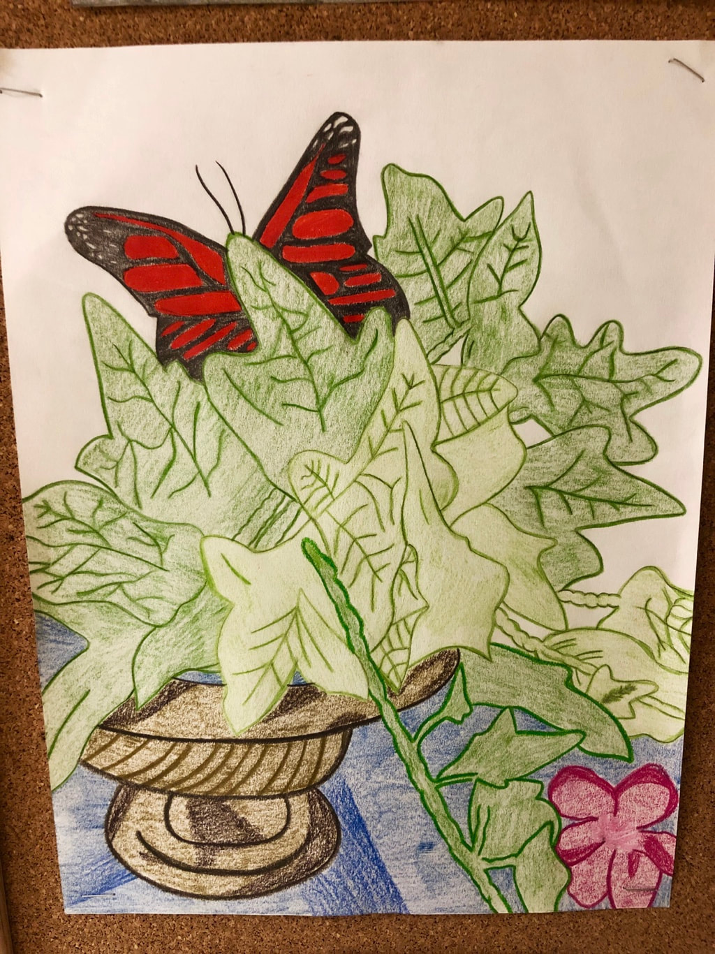
In this “Long Bay Symphony Collaboration Project,” my interpretation of the sound that was played was clearly displayed. I used colored pencils as my medium to create what came to my mind as I listened to the audio.
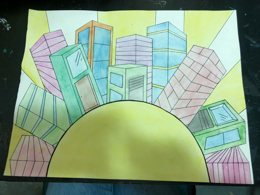
The goal for this project was to create something that was surreal. I used watercolor as my medium to enhance the level of brightness I was trying to achieve. The two point perspective buildings on top of the sun allows the viewer to view this piece as dream-like. The perspective used also creates an illusion of space and depth.
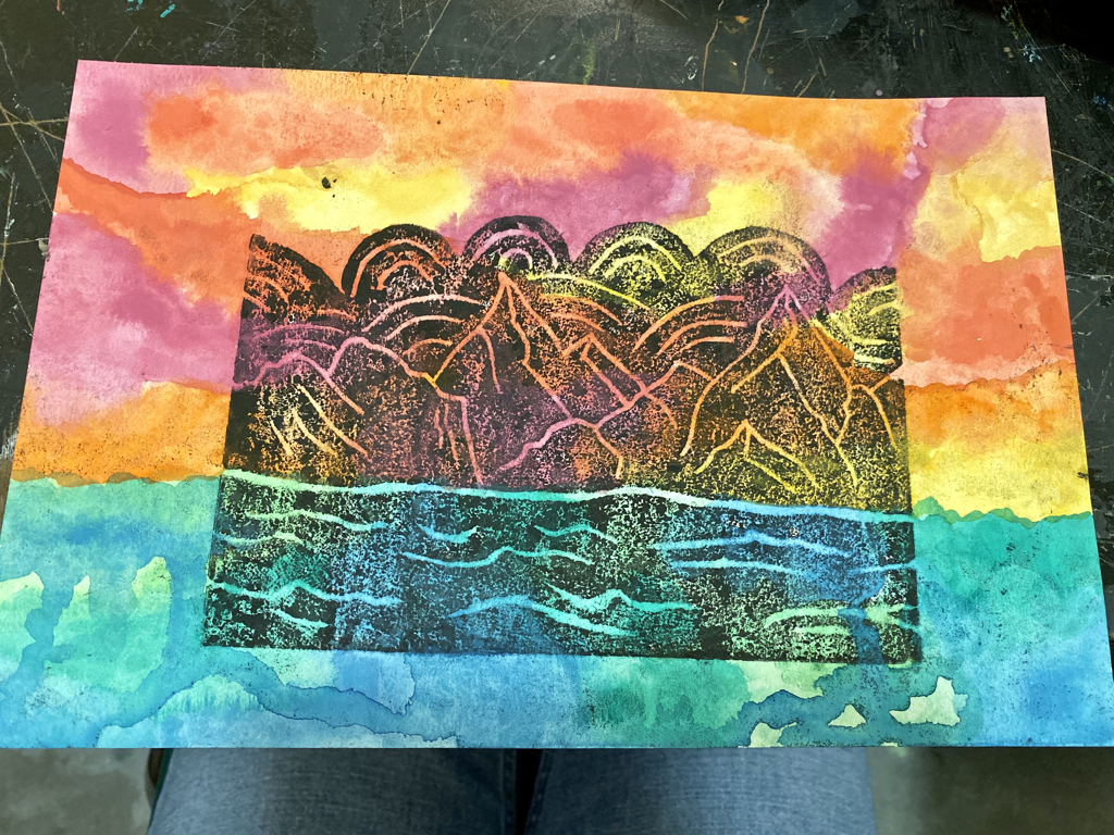
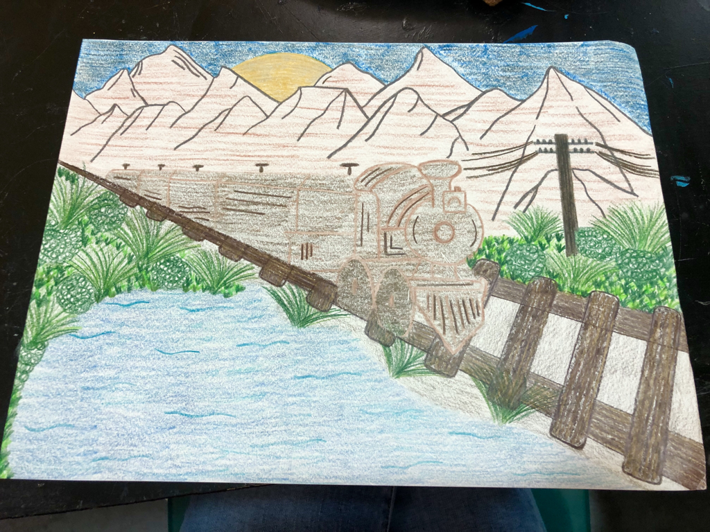
For this piece, I wanted to create the view of mountains overlooking some sort of body of water. I cut out the sky to really emphasize the skyline. I used watercolor as my medium. The overall look of this piece was achieved through the carving out of material.
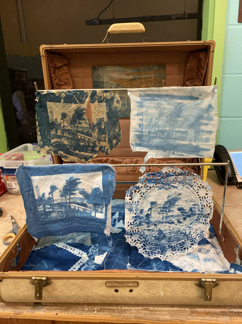
My project, “The Aftermath” consists of five different photographic prints known as cyanotypes. Each print displays the stages of destruction in the Bahamas following Hurricane Dorian. The transition between the first and final image goes to show that it is only a matter of time before complete devastation takes place. The vintage suitcase used to exhibit the prints demonstrates how quickly life has to be packed away in times of natural disaster. The ragged pieces sitting below the prints represent the debris and all of the aftermath following Hurricane Dorian.
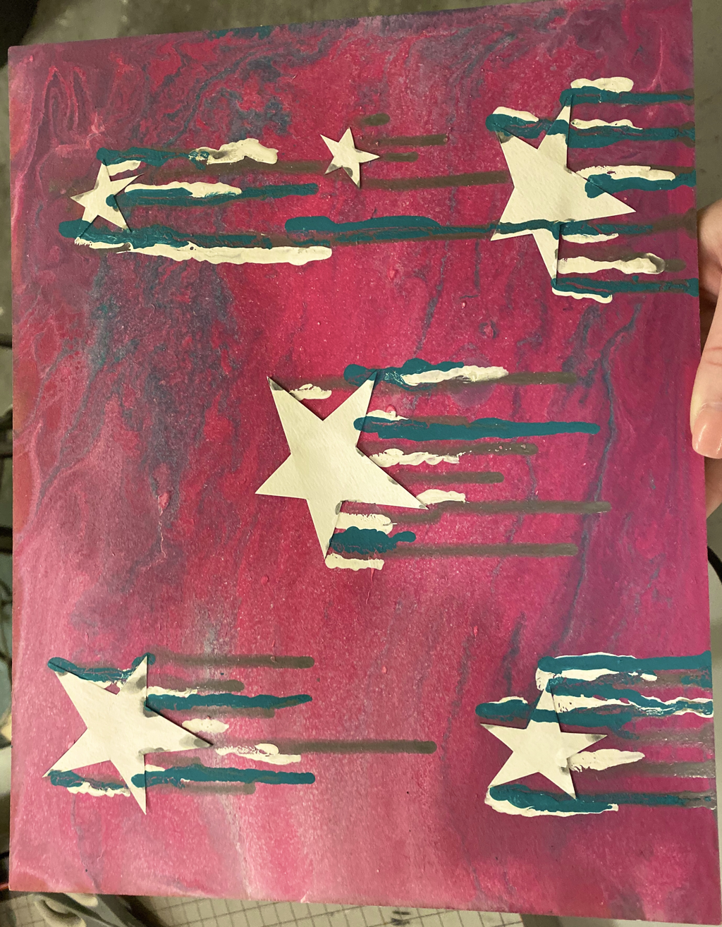
For this project I chose to use the colors pink, blue, and white. The background is a result of the method, pour paint. I chose to add “shooting” stars because of the marbelized texture. I used an additional white, silver, and blue paint to emphasize the look of the stars. To me, this piece represents a starry sky during the summer due to the bright colors I used.
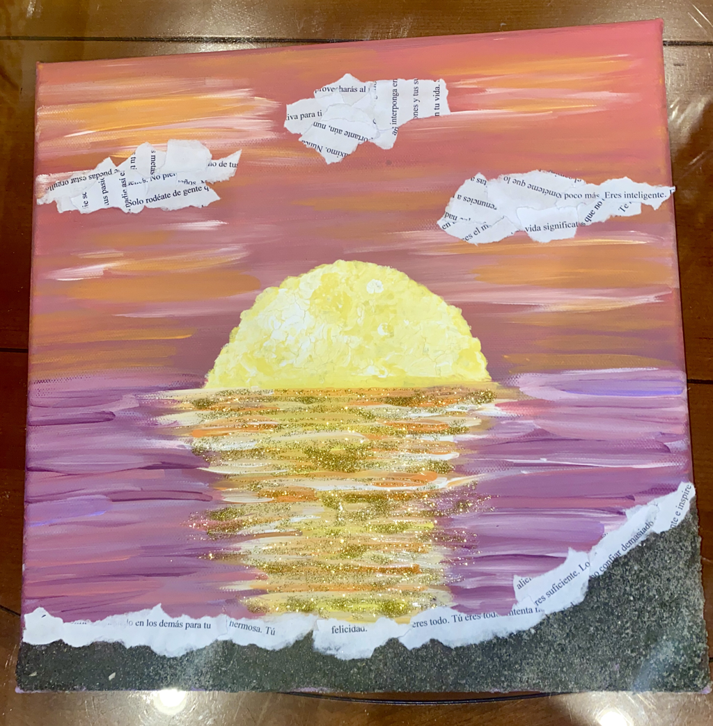
For my final project, I decided to draw one of my favorite things, the sunrise. Along with the letter I wrote to myself, I use paint, glitter, and sand as my three different mediums. The purple, orange, and pink colors create a warm feeling and mood. The letter correlates to both the beach and the piece. I tore the letter up into small pieces to create the clouds in the sky as well as the whitecaps of the waves on the beach. My artwork displays the beautiful sunrise over the coast on a summer morning.
